Friday, December 17, 2010
Night Photography - Part 1 - The gloaming
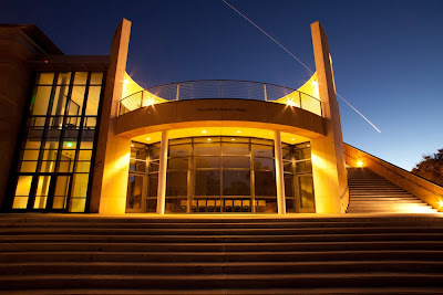
I really like the term "the gloaming". A friend recently introduced me to it when she saw some of the shots I will cover here. Some photographers call it the magic hour. The time between sunset and dark. There is always a moment when the light falling on your subject and the sky light are equal. This works especially well with artificially lit things like buildings or for flash photographs of people. The photos here were of buildings.
I start at about the time of sunset. In the winter I am setting up a little after 4:30 for 4:50 sunset time. I compose my shot on a tripod and then capture every two or three minutes for up to an hour until the sky is getting no darker. I set a fairly small shutter. f/8 or f/11. Then I make sure the focus is right and set it on manual. The autofocus tends to lose its mind if it gets too dark. I find it best to set the camera to aperture priority starting out and look at the histogram to make sure the shutter speed is capturing all the light and not clipping the shadows or highlights. Occasionally if you have a bright light nearby, you will get a completely clipped light. That is ok. Just make sure you won't get a flair on the lens from a light too close.
I also bracket the shots two stops. Exposing extra light and extra dark in case I want to use HDR on an image. It also is a safety in case I need to switch to the higher exposure later.
At just after sunset 5:01 PM, the shot looked like this.
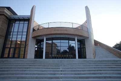
5:01 PM, f/8, 1/2 sec, ISO 100
Notice how the sky is a little blown out. I expose for the building here. You want the exposure to remain relatively consistent in all the shots. So the shutter speed keeps getting longer as the light fades. In the next shot, 12 minutes later, the sky does not look that much different. We keep having to increase the shutter time to keep the building properly exposed. At this point all the lights are on, but they have not caught up to the ambient yet.
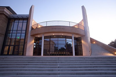
5:14 pm, f/8, 4 seconds, ISO 100
Another 12 minutes later at 5:26, the shutter time is out to 15 seconds. The building is still nicely exposed and the sky is starting to darken.
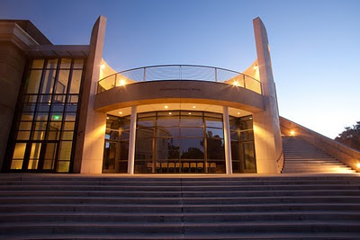
5:26 pm, f/8, 15 seconds, ISO 100
Now things happen really fast. Since most of the light on the building is artificial, you don't need to increase the shutter time any more to keep it properly exposed. I open up another stop to 30 seconds and get lucky when a plane flies over, leaving a pattern in the sky as it is almost dark. This is the shot I have been waiting for. 5:37 pm, f/8, 30 seconds, ISO 100
I keep shooting until it is almost completely dark. Here is the last shot at 6:46. The same exposure as the winner above. Notice how the building edges barely separate from the sky and now the the artificial lights dominate the shot.
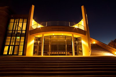
5:46 pm, f/8, 30 seconds, ISO 100
I have put together a video with 8 of these transitions. You can view it by clicking here.
Saturday, December 4, 2010
Self Portraits
I have never really done a whole lot of self-portrait work. I had an assignment where I needed 8 shots. I did not want to do 8 variations on the same shots, so I came up with several ideas. I tried to show different parts of my personality and some of the different roles I play in life. It made me realize how many more I could do. The other big upside about being the model, is that you don't have to worry about the model's time or them wearing out before you do.
The biggest challenge is probably getting the image framed and the focus correct. For focus, I would auto focus on something that I knew was the same distance from the camera as my eyes, then lock it into manual. For framing it was a bit of shoot and chimp (looking at the screen on the camera). It gave me a good appreciation for those doing this on a film camera.
The image above was the first I shot. Pretty conservative, I juiced it up by replacing the blue sky with a cloudy one from another shot and then running a high pass filter and reducing the opaqueness in photoshop. The second shot was on the same day. I decided instead of getting on top of the picnic table, I would get under it. Something unexpected. (Baby steps of daring.) I added the color green to the concrete table and complimentary magenta to the background to create a little tension.
I have always admired the work of Chuck Close, so I decided to do a closeup head shot. (Below) I used a very narrow depth of field, using my 85mm 1.8 lens. I focused on my eyes and wanted as much of the rest out of focus as possible. Light was provided by an alien bees ring flash, the light is so small in my eyes because of the distance from the camera. I ran this through the high pass filter in photoshop to make my imperfections stand out, not too difficult.
The shot below was at the same session as the Chuck Close. I put my glasses back on and put a red filter on the flash, an Alien Bees Ring Flash. Notice how the red filter gets rid of the imperfections. The downward gaze makes this more contemplative.
As I was setting up for a shot I would call the consumer, I was playing around with long exposure and multiple poses. This one was all done in camera. A 4 second exposure. I held for half the shot looking at the camera with my legs crossed. Then, for the second half, I looked out the window and put both feet on the floor. This used a AB800 flash with a softbox, mostly for fill. The key light was camera right from the window.
Below is the one I call The Consumer. It is my favorite. I almost did not submit it. Probably because I was a little embarrassed how much money I have spent on stuff over the years. That pain is probably why it is the most effective shot. For lighting, I used a AB800 with softbox on the camera right. Another AB800 is bounced off the white ceiling to fill the shadows and light the shelf behind. I darkened the lamp in photoshop. (You can see this image bigger by clicking on it, if you really need to see the prices.) The shot after it is the same shot, without the words and with a blue filter on the fill light off the ceiling. It has a totally different feel.
The last two are studio shots with a little more concept. The guitar has always been something I liked but never really mastered. At least I knew enough to make an acceptable chord with my left hand. I had a AB800 with softbox for the main light, camera right. An AB800 above and behind with a red filter. A white poster board behind subject and to camera left to put a little rimlight on my right sleeve.
Last, I did a studio shot with identical lighting to above, except a blue filter on the back light. I call it Cut with The Past. It is meant to symbolize how I am changing my life by switching careers at age 50. I sat on the floor to take the shot of the severed head, using a green filter. I am not totally happy with the result, but it is my first try at doing something like this.
Monday, November 29, 2010
Smiles
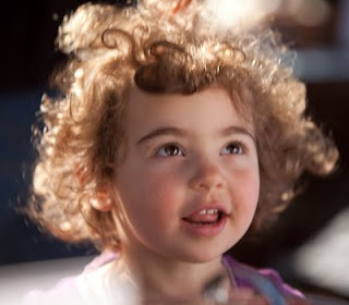
Photographic Portraiture has gotten very serious of late. Many of my favorites show their subjects with blank or serious expressions. I thought it would be instructive to look at a few of the masters of portraiture and how they handle the smile. Before photographs though, Leonardo Da Vinci brought the smile to portraiture with his masterpiece the Mona Lisa. Up until then, portraiture was more lines and exterior without really capturing the spirit of the subject.
Here are some of the masters of modern photographic portraiture and their take.
Jim Carrey by Dan Winters
Blythe Danner by Eric Ogden
Juce Law by Annie Leibovitz
Finally, here is one of my own with a smile.
Christina Holmes by Scott R. Kline
Here are some of the masters of modern photographic portraiture and their take.
Jim Carrey by Dan Winters
Blythe Danner by Eric Ogden
Juce Law by Annie Leibovitz
Finally, here is one of my own with a smile.
Christina Holmes by Scott R. Kline
Friday, October 15, 2010
Face Paint
For an assignment, I had to do complimentary colors. Only two colors were allowed. I love Cyan and Red together. I decided to combine the assignment with portraiture. With only two colors allowed I needed to exclude eyes, so I spray painted sunglasses. I had a great collaborator in Jodi Carr from ArtyParty who does very sophisticated face painting. The shots were done outside in my daylight studio, which is a canopy tent with white backdrop. Below is a shot with analogous colors.
Monday, August 16, 2010
Outside Lands
I had a great time walking around the Outside Lands Music festival. I decided to focus on shooting people rather than the bands. I haven't done much street photography, so this was a chance to do some with a fairly receptive audience. I asked people if I could take their photos before I shot. that is why most are looking at the camera. These were shot with my 5D Mk II and either an 85mm 1.8 or 50mm 1.8 lens. usually, wide open, to blur out the busy background. No flash was used. See the whole set on my Flickr site.
Thursday, August 5, 2010
Senior Portrait
There is a lot written about the new Senior Portrait. I think the new senior portrait is in fact just a thoughtful environmental portrait of a young person who happens to be entering their last year of high school. It is nice to see the personality of the individual come out, instead of putting them in the box of the classic black v neck top on a blue background head-shot. Here is my first take on it. Sara was shot with my Canon 5D Mk II and a 580EXII flash. I used a Coco flash attachment to create a softer ring flash. In the first photo there is a strong backlight from the sun. The second photo was taken in the shade just using the ring flash.
Thursday, July 22, 2010
Jose at Work
I got a job photographing the folks at my day job, selling furniture. Today I shot the warehouse crew and wanted to do something unique. Jose, the warehouse manager, is the master of all he surveys. I wanted to show how he manages so much inventory in two warehouses. I love racks stacked 30 feet to the ceiling filled with furniture. So we posed Jose in between the racks. While he was posing, he was taking calls on his cell phone, so I decided to leave it in the photo.
I lit the scene with three speedlights, a la the Strobist. I recently purchsed two Lumipro LP160s. I used them along with my Canon 580 EX II. For this shot, I used my Canon 5D MK II set at 5.6, ISO 100 and shutter at 1/125. The 580 EX II was on the camera with a Coco Flash ring flash adaptor as a fill. One LP160 is on the camera left for the primary light with a shoot through umbrella. I used the handy slave setting. One more LP160 is behind the subject shooting up to light the racks. The feet of the stand were edited out in photoshop.
Tuesday, July 20, 2010
Windmills - HDR or Photoshop
I guess I have become somewhat of a Photomatix addict lately. It is easy to shoot the three shots at +/- 2 stops and combine them. Usually you get a great result. For my windmill shots, there were a few problems with this formula. 1) the windmills were moving, so I got ghosting for the different positions of the blades in the three shots when they were combined. 2) The shots were taken in pretty intense afternoon sun so shadows were very deep. I tried this shot both ways with Photomatix and then just with editing in Photoshop. I prefer the photoshop image above. I pulled in the whites and blacks and increased the contrast. I masked out the barn so it didn't get so black. Then I painted back in the trailer to increase the red. Next I boosted the taturation in the whole image and brightened up the car and tractor. Below is the Photomatix image and the bottom is the original shot at ISO 800, focal length 90MM, f/5.6 1/1000 sec. with my Cannon 5D Mark II using my 70-200MM, f2.8 lens.
Thursday, July 8, 2010
Gas Station Route 66
We found this loverly abandoned gas station along old Route 66 in Santa Rosa, NM. The sky was beautiful with clouds. I shot three exposures at ISO 250 f/9.0 and a focal length of 24mm on my Canon 24-105 f4 lens. The first was at 1/320 sec, second at 1/1250 and third at 1/80. I set the camera on continuous shoot for he three shots and hand held it. I combined the three shots to form an HDR image using Promatix. In Photoshop, I increased the contrast using a levels adjustment. I then boosted the saturation a little using the Hue/Saturation adjustment. The original is below.
You can see more shots from my road trip at www.scotrrklinephoto.com.
Stairway_MCA
This photo was taken under the stairs in the Museum of Contemporary Art in Chicago. It looks up at their very nice spiral staircase. The original color version of this did not have the high contrast. There were lots of reflections under the stairs. You can still see them in the middle set of stairs. I increased the black and the contrast to reduce the reflections and then finally painted in black using the clone stamp to get rid of the rest. I like the lines and the black white contrast.
This was taken with my 5D Mark II and no flash. ISO was boosted to 2000 because of the low light but it did not hurt the resolution in my opinion. i used my zoom lens at 45 mm, 1/40 sec and aperture at f/9.0. Original shot is below.
Friday, June 4, 2010
iFlower
I was getting ready to retire for the night in my hotel room. I turned off the lights and noticed this white flower practically glowing from the table near the bed. The blinds were drawn behind it giving it a nice background. I set my 5D Mk II to 6400 ISO and laid it on the table, not having a tripod. The flower did not separate from the blinds very well, so I lit it with my iPhone from above, shielding the blinds from the white light with my hand. The exposure was .6 seconds, aperture f/4.0 and the lens focal length was 76mm.
Sunday, May 23, 2010
Street Photography
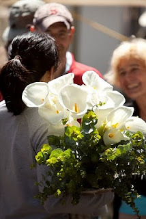
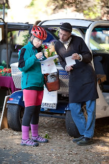
I have not done much street photography. I always felt a little self-conscious about shooting people without their permission. The big SLR makes people get a little weird too. So when I got a new my 70-200 mm lens, I was anxious to try it from a little distance. At the Palo Alto Famers Market, where my wife sells her ipies, I pulled it out. The early morning light was great. I got some shots I was very happy with.
Obviously, these were shot with the lens fairly wide open. In order at f4, f2.8 and f4.5. No extra light and no poses. I guess you would call it street photography. i feel like these shots captured the mood and moment of the morning.
Wednesday, May 19, 2010
Camera Descending a Staircase
I always liked Duchamp's painting "Nude Descending a Staircase". So when I was shooting photos of cameras and robots for Videre Design, I decided to pay homage with a little creation of my own. This stereo camera has its own set of legs, so i wanted to anthropomorphize it. I shot the camera at 8 different angles on a white background. The I deleted the background and layered the different angles on top of each other in photoshop. I blended them with different levels of opacity and even stretched and bended one with the free transform tool. It was a fun result.
I used a similar technique for a self portrait last year. I used 9 of 12 views shot. I did this one before I knew how to blend, merge and feather.
Wednesday, May 12, 2010
Death Valley In Color
I have done a whole series of these shots in black and white on my photo website, but wanted to get one in color. So I decided to put some of my new photoshop skills to the test.
This shot was taken in Death Valley about 1 hour before sunset. I used my Canon 5D Mk II with a 24-105 zoom at 105mm focal length. F/14 at 1/60 was the exposure. ISO 100. I was hoping for the side light and long shadow and got them. However, the sky on this shot was washed out and the mountains in the background were hazy.
In photoshop, I spotted the bushes and the footprints out of the dunes. Next I increased the overall contrast. Then I de-saturated the mountains to get rid of the blue haze and make them stand out more from the sky. I de-saturated the dunes removing color. I then sampled the dunes in the original background to get a more uniform color. And repainted them with it. Finally, I darkened the sky and added some magenta.
Friday, May 7, 2010
Smokie - People with Scars
Smokie was the subject of another of my “People with Scars” series portraits. I met Smokie walking down the street in San Francisco. He was sitting on the sidewalk panhandling while his prosthetic leg was prominently displayed. I walked past him the first time and then, doubled back to ask him to pose. I explained my project. He said he had lost his limb to an infection that was the result of intravenous drug injection. Later he told one of the people assisting me on the shoot he had lost it is a car accident. $20 and a blanket bought at Ross convinced him to pose. He showed up as agreed two days later at the studio. He was very cooperative and took off the limb. He waited patiently while I changed the lighting. He asked that I not use his real name on the internet.
I shot this using a Profoto 1200. Beauty dish from the right. Strobe from behind and left. Fill light from the left front.
Tuesday, April 13, 2010
Persistence - Cupertino Bridge
Marabel Morgan said, "Persistence is the twin sister of excellence. One is a matter of quality; the other, a matter of time." The shot above took me a long time to get. I knew this bridge was a great subject the first time I saw it driving under it on the freeway.
The first time I shot it, six months earlier, I had just gotten my Canon 5D Mk II. I did not have my wide-angle lens yet and really knew nothing about the camera. The image (middle Left) was a good one, but not that exciting to me.
I went back again recently with my 17-40mm lens, tripod and shot the bridge at night using a 20 second exposure at f/16. I decided to emphasize the cables rather than the triangles. The cables in the back were very dark and there was significant lens flare around the back triangle support. (Image Pre-Photoshop Lower Left) Using some Photoshop skills I acquired in school on masking and levels I corrected the lens fair and the overexposure on the triangle. I then brightened the cables in the back. The image is still not perfect, but it is getting more perfect.
A teacher told me that Ansel Adams didn’t like one of his early images on the contact sheet. But as he learned his craft he went back to review the sheets and realized he now had the skills to print as he had envisioned. Harry Callahan was known to return to subjects again and again until he got the shot he wanted. Persistence, it seems, is another tool that we photographers should always keep in our camera bag.
Friday, April 9, 2010
Scar Portrait
People with scars are the subject of my current portraiture project. My friend Renata, who is a dermatologist and is very comfortable with her scar, which she received in a skiing accident, inspired it. I wanted to show Renata’s strength and how the scar really makes her even stronger and more interesting.
This was shot with an Alien Bees B800 on the left using a 43-inch shoot-through umbrella. Another B800 with a grid pointing just above the scar on her left arm. Finally one B800 lighting the black background. Camera was my Canon 5D Mk II at f/10. 50mm focal length.
Sunday, March 28, 2010
Easy HDR
I was walking by a Shell Station in Palo Alto and noticed two Cadillacs in the bays. I thought it might be an interesting photo. But I could tell, that the bright sun would force me to expose for the shadowed Cadillacs or the exterior. So I set my camera to expose for normal. Then two stops up and two stops down. Here are the resulting shots. All are at f/11. The first, exposed at the normal reading is at 1/250 shutter. The darker one is at 1/1000 and the third at 1/60.
I then exported all three to Photomatix Pro to combine them into one HDR image. Photomatix is an easy way to get the darks, medium and light tones all in one image. I used the automatic setting for tone mapping. I then got the following image. Notice how the sky is more deep blue and details are now visible in the bays.
I was not nuts about the unrealistic nature of the photo, so I wanted to convert to black and white. I then exported to photoshop, converted to B&W in layers. I brightened the yellows to make them white and darkened the reds and blues. Cropped and got the resulting B&W image.
Subscribe to:
Posts (Atom)